This is Part 1 of a multi-part review of Fedora 18’s updated and redesigned installer:
- Part 1: Nutshell, Background, My Test Setup, and Starting the Install (this part)
- Part 2: Storage Device Selection and Selected Disks Dialog
- Part 3: Installation Options and Reclaim Disk Space dialogs
- Additional parts are on their way.
The new installer has been talked about in several Fedora 18 reviews. Opinions range from Igor Ljubuncic’s verdict of “Worst ever” and Alan Cox’s pronouncement that “The new installer is unusable” to Rob Zwetsloot saying “the new installer is a wonderful, minimalist designed app” and Hedayat Vatankhah’s statement that “with a new UI, it now looks good too.”
This review will specifically cover how the installer works for a relatively complex installation: What happens if you have an existing server with multiple disks, multiple RAID arrays, multiple volume groups and logical volumes, and you want to install Fedora 18 in addition to what’s already on the system without wrecking the existing setup?

This post is primarily aimed at experienced Linux system administrators.
In a Nutshell
If you want a review in three sentences, here you go:
The Fedora 18 installer has some good points as well as some serious flaws. Overall, I think it is not as good as the existing installer, but that’s because it is a new, immature product. In the long term, I think it has the potential to become better than the current installer once all of the kinks and flaws get worked out.
A few specific items:
- Some people may prefer the new look — it has a clean and simple design. It is, however, a shocking departure from the expected for people who’ve been using Red Hat distros for any length of time.
- There are some poor flow, layout, and button naming decisions. These will probably be fixed as the new installer design matures.
- The installer seems to have more of an “assume the installer is dumb” philosophy than previous versions. This may be helpful for Linux neophytes if done right (I’d argue that it’s not), but can be frustrating for experienced Linux admins.
Background
I maintain a “do everything” server in my home. It stores and serves files (including CD and DVD images), does PC backups, runs bittorrent, provides a squid caching web proxy, handles e-mail, runs an Apache web server, runs virtual machines (including a PBX In a Flash Asterisk server), and more.
This server runs Fedora. Every three versions of Fedora, I “upgrade” my server. “Upgrade” is in quotes because I don’t do a standard upgrade. Instead, I leave the existing install alone and intact, and install the new version of Fedora alongside it. If I have problems, I can just revert to the existing install. When everything’s functioning the way I want it, I permanently switch to using the new version. This approach has worked well for me through Fedora 6, 9, 12, and 15.
Now that Fedora 18’s out, it’s time to “upgrade” again.
My Test Setup
In the past, I’ve done my upgrades without testing beforehand. Given some of the things I’d read about Fedora 18, though, I decided this time around to test things out using a virtual machine first. Thus, I started by building a simplified virtual replica of my server in VirtualBox. This review is based on my experience on that virtual machine. If anything changes when I do the install on my actual server hardware, I’ll post an update.
Here’s how I set things up:
I installed Fedora 15 on the virtual machine. During setup, the six virtual hard drives on the machine (four 2 TB and two 1.5 TB) were partitioned as follows:
[table “” not found /]Logical volume management was set up as follows:
[table “” not found /]On my actual server, partition sizes were slightly different, and the unused partitions contain additional RAID-5 arrays which are also part of the vg.raid5 volume group. This was done so that if I later decided that I wanted to switch some or all of my storage to RAID-10 or btrfs that could be more easily accomplished.
Starting the Install
After an initial isolinux boot process, the anaconda installer starts up, and you’re presented with a screen where you select what language to use:
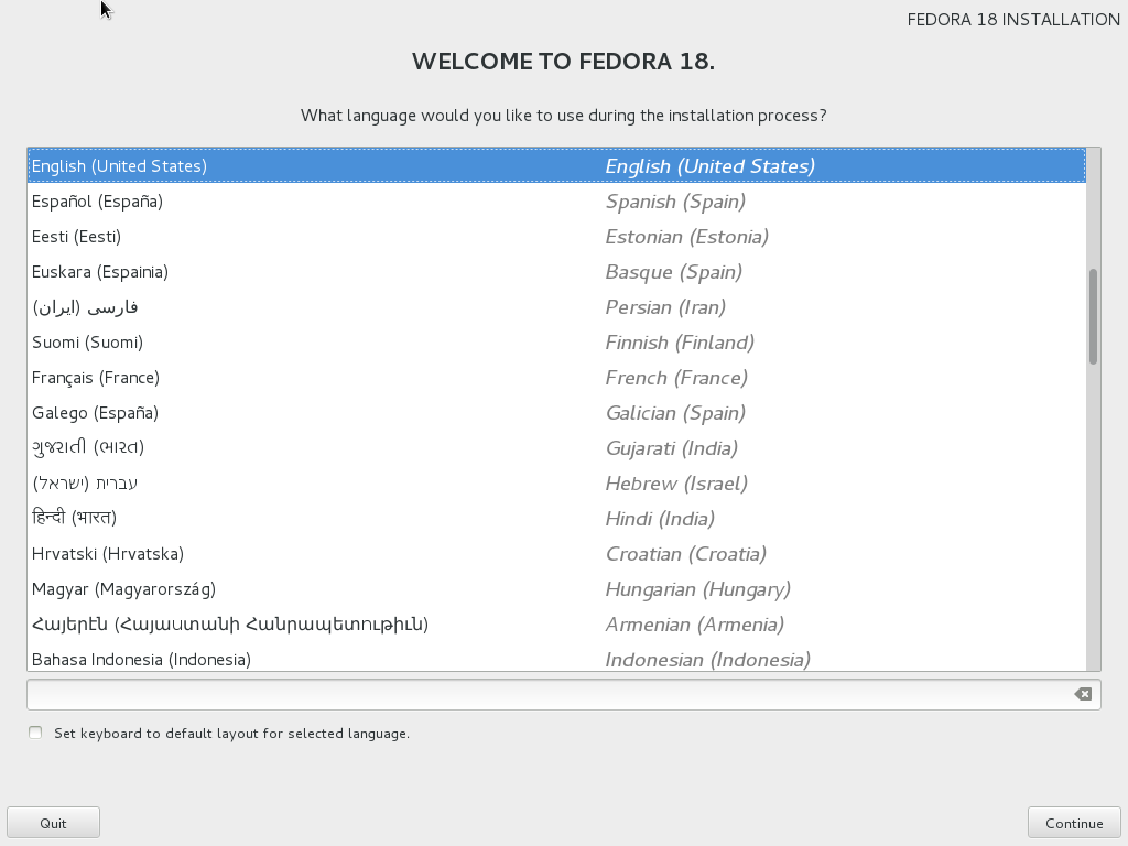
Click to view full size.
So far, this is pretty much exactly the same as any previous Fedora install. However, once you’ve selected your language, things suddenly get very different. In previous releases of Fedora you would next select your keyboard type, and then the installer would walk you through storage configuration, package selection, etc.
In Fedora 18, you’re instead immediately presented with this screen:
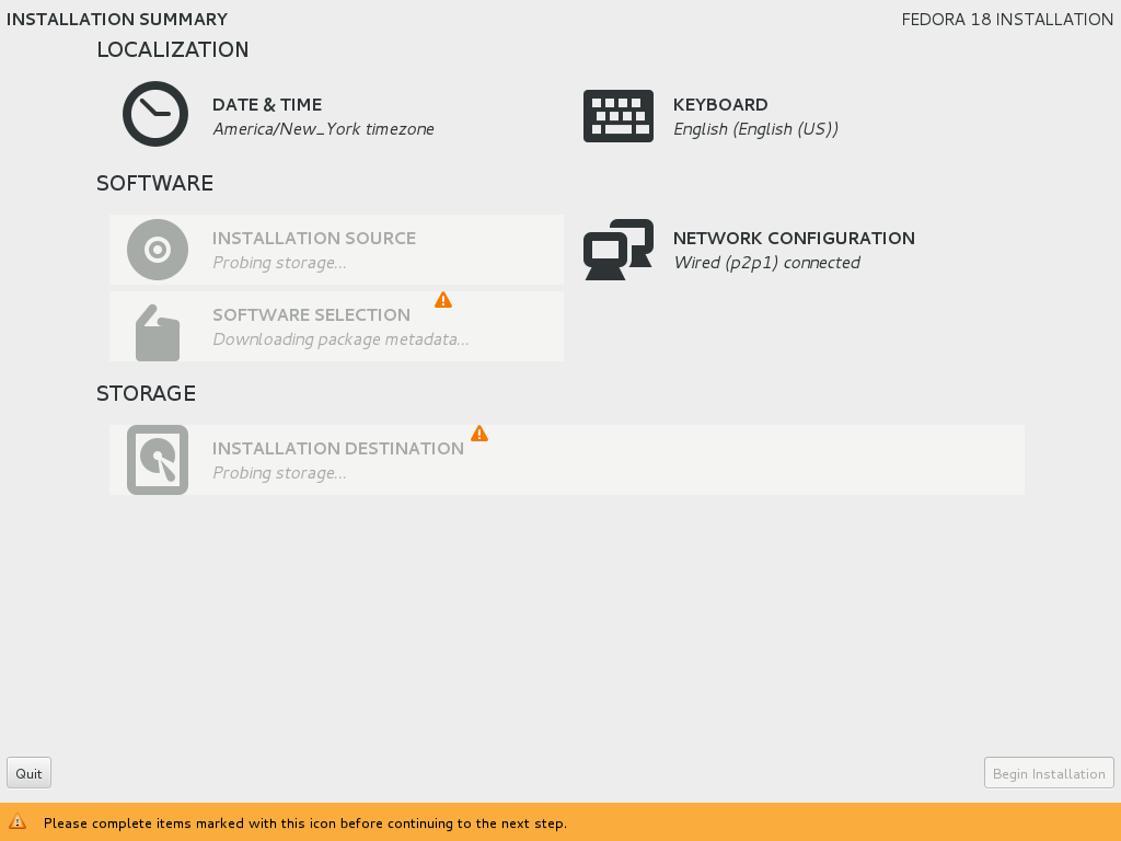
Click to view full size.
 This new setup is nice for a couple reasons:
First, it lets you skip configuration steps. For advanced installers, not needing to hit ENTER or click an extra “Next” button when you just want to accept default settings is nice.
Second, it shows at a glance if there is anything that you haven’t configured yet but are required to configure. No orange warning icons? Great — just click “Begin Installation” and be on your merry way!
 On the other hand, there are a few problems:
Remember how I said above that you can skip configuration steps? Well… That can cause issues too. New users might accidentally neglect to change a setting that they really want to set. For instance, a user with a French keyboard who’s just using the mouse for the install might forget to change the keyboard type.
Others have also pointed out that a big orange bar and warning symbols dotting the screen isn’t exactly user-friendly. It can give users the impression that they’ve done something wrong and need to fix it.
Perhaps the biggest issue, though, is a (hopefully unintended) result of the way that the new installer does things in parallel. The installer throws screens up as quickly as it can, and lets the user start interacting with them even while it’s still doing things behind the scenes. In principle, this is a great idea, but it’s not implemented very well here.
When you first see the “Installation Summary” screen, it looks like the screen shot above, complete with a warning icon next to “Software Selection” and several greyed out sections. After a short while, the installer finishes probing storage and the “Installation Destination” section suddenly becomes available:
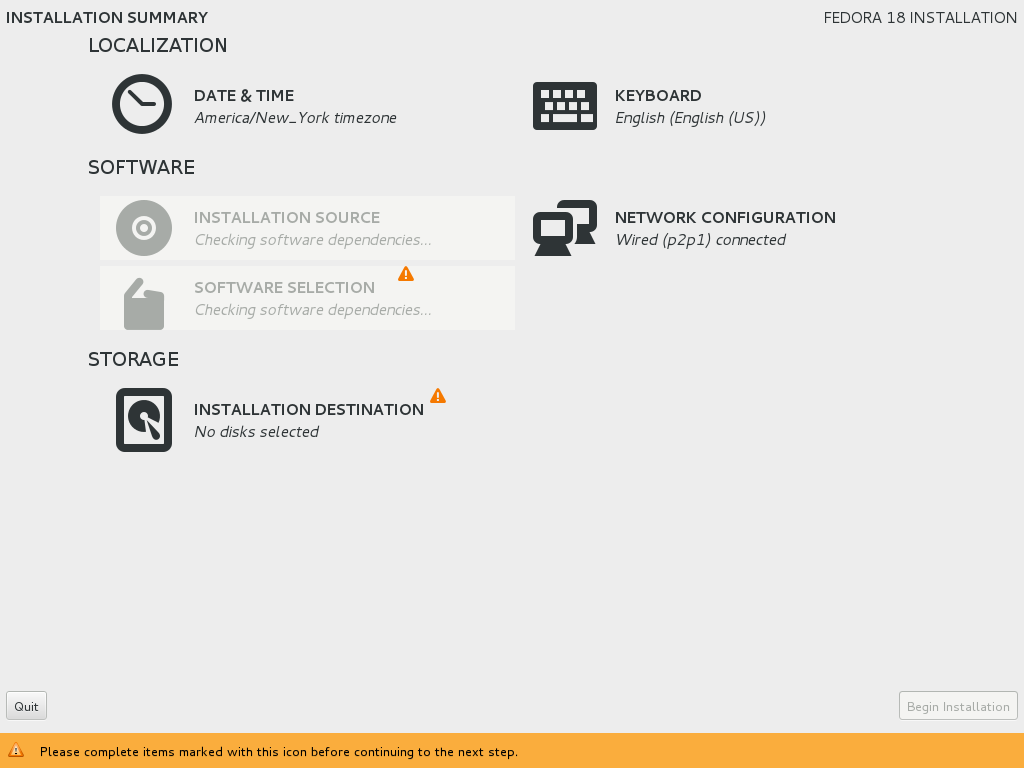
Click to view full size.
Then, after the installer finishes chugging through its software dependency checking, the “Installation Source” and “Software Selection” sections become available. The little orange warning icon next to “Software Selection” also magically disappears:
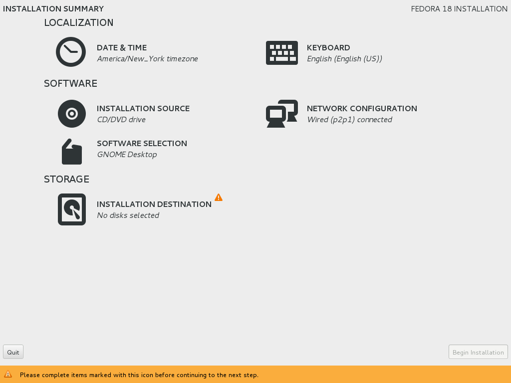
Click to view full size.
This is just plain bad design.
Users should never be told that they need to do something when it’s really the program that needs to do something. And if that warning suddenly disappears after a few seconds when the program gets its act together, it may just confuse the user more.
Also, if a section is greyed out because the program is doing something, this needs to be made abundantly and obviously clear to the user. The installer does show status messages like “Probing storage,” “Downloading package metadata,” and “Checking software dependencies,” but these are themselves greyed out. A much better choice would be to display a progress bar or hourglass next to sections that will become available after the program finishes doing its behind-the-scenes work.
This concludes Part 1. Next: Part 2: Storage Device Selection and Selected Disks Dialog.